Luxury Label Design Ideas for Small Brands
TLDR
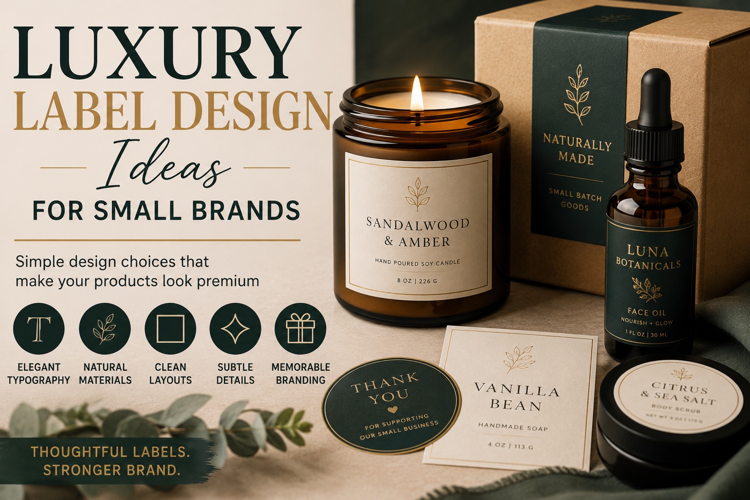
Luxury label design ideas do not have to be expensive or complicated. The best labels usually feel clean, balanced, and intentional.
Small brands can create a more polished product look with better typography, simple color palettes, matte finishes, clear spacing, quality materials, and one or two thoughtful details.
Start with the label’s job: help customers understand the product, trust the brand, and feel good about buying it.
Introduction
A label can make a small product feel established before the customer ever opens it. That is a lot of pressure for a few square inches of paper, vinyl, or film.
That is why luxury label design ideas matter for small brands. A candle, coffee bag, skincare jar, soap wrap, sauce bottle, or boutique product can look more refined with the right label choices. Not louder. Not busier. Just more considered.
Luxury label design is often misunderstood. It is not about adding gold to everything or making the label look expensive for its own sake. It is about restraint, clarity, texture, spacing, and consistency. A small brand can look polished with a simple matte label, a strong logo, a readable product name, and enough white space to let the design breathe.
The goal is to make the product feel trustworthy and giftable without pretending to be something it is not. Small brands have their own strengths: personality, care, small-batch quality, and a closer connection to customers. The label should support that.
Start With a Simple Label Layout
A luxury label usually feels calm because the layout is organized.
Before choosing colors, finishes, or decorative details, decide what information belongs on the label. Then give each piece a clear place.
Most product labels need:
- brand name
- product name
- scent, flavor, formula, or variation
- size or quantity
- short product description
- required details for the category
- website or contact information, if useful
The mistake many small brands make is trying to put everything on the front. The front label should help the customer recognize the product quickly. The secondary details can go on the back label, side label, hang tag, insert card, or product page.
For example, a candle label might place the brand name at the top, the scent name in the center, and the size near the bottom. The burn instructions and safety information can go elsewhere. A skincare jar might feature the product name and formula type on the front, then move ingredients and directions to the side or back.
A clean label does not mean empty. It means the customer can understand it without effort.
Use Typography That Feels Refined and Readable
Typography does a lot of the work in luxury label design.
The right font can make a label feel modern, traditional, handmade, botanical, bold, quiet, or elegant. The wrong font can make the product feel rushed, even if the product itself is excellent.
A good rule: choose one main typeface and one supporting typeface. That is usually enough.
Common pairings include:
| Label Style | Font Direction |
|---|---|
| Modern skincare | Clean sans serif with generous spacing |
| Small-batch candles | Serif font with simple supporting text |
| Artisan food | Warm serif with clear product details |
| Boutique coffee | Strong sans serif with subtle script accent |
| Natural goods | Minimal serif or soft sans serif |
| Gift products | Elegant serif with restrained decorative type |
Be careful with scripts. A script font can add personality, but it can also become hard to read at small sizes. If the product name must be read quickly on a shelf, use script sparingly.
Letter spacing can also help. Slightly spaced-out uppercase text often feels more refined than cramped text. But do not overdo it. The goal is quiet confidence, not a ransom note from a design student.
Choose a Restrained Color Palette
Luxury labels often use fewer colors than expected.
That does not mean every label has to be black, white, and gold. It means the palette should feel controlled. Too many colors can make a product look less polished, especially when the label is small.
Strong small-brand palettes include:
- cream, charcoal, and soft gold
- forest green, ivory, and warm tan
- black, white, and copper
- blush, clay, and deep brown
- navy, cream, and brass
- sage, white, and muted gray
- espresso, cream, and terracotta
If your product line includes multiple scents, flavors, or variations, use color as a system. For example, each candle scent might have a small color band. Each sauce flavor might use a different accent color. Each skincare formula might use a different icon or small block of color.
The brand should still feel consistent across the full collection.
A good test is to line up all your products together. If the labels look like they came from five different companies, the palette needs work.
Make White Space Part of the Design
White space is one of the easiest ways to make a label feel more premium.
White space does not have to be white. It can be cream, black, clear, kraft, pale green, or any calm background area. The point is giving the design enough room.
Crowded labels often feel cheaper because every element is fighting for attention. A luxury label usually gives the most important information space to stand out.
Use white space around:
- the logo
- the product name
- the scent or flavor
- icons
- borders
- required details
- decorative artwork
This is especially important for small containers. A 2-inch label does not have room for a full brand story, five icons, a paragraph, a pattern, three fonts, and a decorative border. Something has to go.
A stronger label often comes from removing one more thing.
Use Matte Finishes for a Softer Look
Matte finishes are a natural fit for many small brands trying to create a refined product look.
Matte labels reduce glare and give packaging a softer surface. They can work especially well for candles, skincare, bath products, coffee, tea, stationery, and handmade goods.
A matte finish pairs well with:
- neutral palettes
- serif typography
- botanical artwork
- minimalist logos
- kraft packaging
- soft color systems
- clean product photography
Gloss can still be useful, especially for bright food labels, bold beverage branding, or products that need more shine. But if your goal is a more subtle, polished presentation, matte is often the safer first choice.
For product packaging, custom product labels can help small brands create a more consistent look across jars, boxes, bottles, bags, and wraps.
The finish should match the product. A spa-style body oil may look better with a soft matte clear label. A bright hot sauce may need gloss or bold color. The best choice depends on the brand.
Try Clear Labels for a Minimal, No-Label Look
Clear labels can create a clean, modern effect, especially on glass, plastic, jars, and bottles.
They work well when you want the container or product color to show through. This can be useful for honey jars, skincare bottles, candle vessels, beverage containers, bath products, and minimalist packaging.
Clear labels are strongest when the design has good contrast. White, black, or dark green text can look beautiful on clear material, but pale colors may disappear depending on the container and product inside.
Use clear labels when:
- the container is attractive
- the product color supports the brand
- the design is simple
- the text is large enough to read
- the label shape will not distract from the package
Clear labels can also make small brands look more polished because they reduce visual clutter. The product feels less covered up.
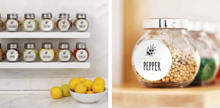
For a simple transparent look, clear sticker labels can work well on glass jars, bottles, and packaging where the surface should show through.
Add One Special Detail, Not Five
Small luxury details work best when they are used with restraint.
This is where many labels go wrong. A brand adds foil, script, a border, a pattern, a texture, a seal, a ribbon, a monogram, and a decorative icon. Suddenly the label looks busy instead of high-end.
Choose one special detail and let it matter.
Good options include:
- thin gold accent line
- small monogram
- subtle border
- single botanical illustration
- embossed-style logo effect
- metallic accent color
- textured background
- small batch number
- signature mark
- custom icon
Even if your label printer does not offer true foil stamping or embossing, you can still create a refined look through color, contrast, spacing, and illustration. A printed gold tone will not be the same as actual foil, but it can still create warmth when used carefully.
The principle is the same: one thoughtful detail looks better than five competing details.
Match the Label to the Product Category
Luxury looks different depending on the product.
A candle label should not automatically look like a wine label. A sauce label should not look like a skincare label unless there is a real brand reason. Customers bring different expectations to each category.
Here are a few practical directions:
| Product Type | Label Direction |
|---|---|
| Candles | Minimal typography, scent name, warm neutral palette |
| Skincare | Clean layout, clear product function, soft matte or clear label |
| Coffee | Strong logo, origin or roast details, earthy palette |
| Soap | Natural texture, simple scent system, readable product name |
| Gourmet food | Flavor clarity, bold but controlled color, appetite appeal |
| Boutique goods | Elegant logo, generous spacing, simple packaging seal |
| Tea | Soft color coding, calm typography, botanical details |
| Fragrance | Minimal front label, strong name, restrained accent |
Category matters because the customer needs to understand what they are looking at. A beautiful label that does not explain the product clearly is still not doing its job.
Luxury label design should make the product easier to trust, not harder to identify.
Create a Label System for Product Lines
One label is a design. A group of labels is a system.
Small brands often start with one product, then add variations later. That is when label design gets messy. The first label looked nice, but now there are six scents, four flavors, or three sizes, and nothing lines up.
Plan the system early.
Decide what stays the same across every label:
- logo placement
- label shape
- font choices
- product name location
- size information
- border style
- icon style
- background color
- spacing rules
Then decide what can change:
- scent name
- flavor color
- small illustration
- batch number
- accent band
- product description
- variation icon
A label system helps customers recognize your products as a family. It also makes future launches easier because you are not redesigning from scratch every time.
This is especially useful for candles, sauces, coffee bags, tea tins, skincare lines, and handmade products with multiple variations.
Use Shape to Make the Label Feel Custom
The label shape can change how the whole product feels.
A rectangle is practical and clean. A circle feels friendly and simple. An oval can feel classic. A die cut shape can feel more custom. A tall narrow label can make a bottle feel elegant. A small seal can make packaging feel finished.
Good label shapes include:
- circles for jars, lids, seals, and simple branding
- rectangles for bottles, boxes, and product information
- ovals for classic food, bath, and gift products
- arched labels for candles, wine-inspired goods, and boutique packaging
- custom die cut shapes for logos or signature icons
- wrap labels for jars, tins, and boxes
The shape should fit the container and the design. A label that is too large can make the package feel heavy. A label that is too small can look like an afterthought.
Before ordering, print the label size on regular paper and place it on the container. This quick test catches a lot of awkward sizing issues.
Design for Product Photography
Small brands sell through photos as much as through shelves.
Your label needs to look good in product photography, especially if you sell online. That means the label should be readable in a thumbnail, not only in a close-up.
Check your label in these situations:
- straight-on product photo
- angled lifestyle photo
- group product lineup
- social media square crop
- website product grid
- marketplace thumbnail
- package insert photo
- shelf or booth display
Matte and low-glare labels are often easier to photograph. Strong contrast also helps. If the product name disappears in a thumbnail, customers may scroll past without ever clicking.
Good label design supports the photo. It does not rely on the customer zooming in.
Make Your Packaging Feel Complete
The main product label matters, but the full package matters too.
Luxury label design can extend to:
- box seals
- tissue stickers
- thank-you labels
- ingredient labels
- lid stickers
- small batch labels
- care instruction stickers
- QR code labels
- shipping box stickers
- hang tags
A small brand can create a more complete packaging experience with a few matching pieces. The product label, box seal, and thank-you card should feel connected.
This does not mean every piece needs to repeat the same design. It means the logo, color palette, typography, and tone should match.
You can use https://customstickers.com/ for branded stickers, labels, and packaging pieces that help keep the look consistent across the customer experience.
Avoid Common Luxury Label Mistakes
The fastest way to make a label feel less refined is to add too much.
Common mistakes include:
- too many fonts
- too many colors
- tiny unreadable text
- low-contrast type
- crowded borders
- oversized logos
- generic gold effects
- decorative elements that do not fit the product
- inconsistent label sizes across the line
- product names that are hard to find
- required details squeezed into the front label
Another common mistake is copying luxury categories without understanding them. A candle brand does not need to look like a champagne bottle. A soap brand does not need to look like a perfume box. Inspiration is useful, but the label should still fit the product and customer.
Luxury is often about confidence. Confident labels do not try to say everything at once.
Small Brand Label Checklist
Use this before sending a label to print:
- Is the product name easy to find?
- Is the brand name readable?
- Does the label match the product category?
- Are the fonts consistent?
- Is there enough white space?
- Does the label look good at actual size?
- Can customers read it in a product photo?
- Are the colors consistent with the rest of the brand?
- Does the finish match the product style?
- Is one detail doing the work, instead of five?
- Does the label system work for future products?
- Are required details included somewhere appropriate?
If you are unsure, simplify first. Then add detail only where it improves the label.
Conclusion
Luxury label design ideas for small brands are less about chasing expensive effects and more about making careful choices. A clear layout, readable typography, restrained color palette, quality finish, and thoughtful spacing can do more than a crowded design full of decorative extras.
Start with what the customer needs to understand. Then make the label feel polished through balance, consistency, and one or two memorable details. The result should feel like your brand at its best: clear, trustworthy, and worth picking up.
A small brand does not need to look like a giant company. It just needs to look considered.