How to Build a Brand Customers Instantly Recognize
TLDR
A recognizable brand is built through repetition, clarity, and consistency.
Customers remember brands that use the same logo, colors, fonts, product photos, packaging, tone, and customer experience across every touchpoint.
Start with a simple brand system. Then use it everywhere: your website, social media, labels, stickers, packaging, emails, printed materials, and customer follow-up.
Introduction
Customers often recognize a brand before they read the name. They notice the color. The shape. The style of the photos. The packaging. The way the message sounds.
That is why learning how to build a brand customers instantly recognize is not just about having a good logo. A logo helps, but recognition comes from a larger pattern. The same visual and verbal cues need to show up again and again until the customer starts connecting them with your business.
For small brands, this can feel harder than it is. You do not need a giant brand manual or a full design team. You need a clear set of choices and the discipline to keep using them. A consistent color palette, repeatable packaging style, recognizable product labels, clear photography, and steady messaging can make a small business feel much easier to remember.
The goal is simple: when someone sees your product, package, post, booth, sticker, or thank-you card, they should know it is yours.
Start With What You Want to Be Remembered For
Recognition starts with focus.
Before choosing colors or designing packaging, decide what customers should associate with your brand. If you try to be everything, the brand becomes harder to remember.
Ask:
- What do we sell?
- Who is it for?
- What should customers feel when they see it?
- What do we want to be known for?
- What makes the product or service easy to recognize?
- What should never change about the brand?
A coffee brand might want to be remembered for bold flavor and simple packaging. A candle brand might want to be remembered for calm scents and warm, neutral labels. A sticker shop might want to be remembered for bright artwork and fast, reliable customization. A bakery might want to be remembered for playful packaging and seasonal treats.
The answer does not need to sound fancy. In fact, simple is better.
Try this sentence:
“Our brand should be remembered for [main quality] and [main experience].”
Examples:
“Our brand should be remembered for clean design and thoughtful packaging.”
“Our brand should be remembered for bold colors and fun local gifts.”
“Our brand should be remembered for durable products and quick reorders.”
That sentence becomes a filter for future design choices.
Build a Simple Visual System
A recognizable brand needs a visual system. Not just a logo.
Your visual system is the group of design choices customers see over and over. It should include:
- primary logo
- simplified logo or icon
- brand colors
- fonts
- photo style
- graphic elements
- product label style
- packaging style
- spacing and layout preferences
This does not need to be complicated. A small brand can start with one logo, one icon, two fonts, and three colors. That may be enough.
The problem starts when every new product, flyer, label, social post, and packaging insert gets designed from scratch. The brand begins to look scattered. Customers may still like the product, but they have a harder time remembering who made it.
A visual system gives every piece a shared identity. Your Instagram post, product label, shipping sticker, and thank-you card do not need to match exactly. But they should clearly belong to the same business.
Use Color Consistently
Color is one of the fastest recognition tools a brand has.
Customers may forget the exact words on your label, but they can remember a deep green box, a bright orange sticker, a soft pink mailer, or a black-and-cream product line.
Choose a small palette and use it often.
A practical color system might include:
| Color Role | Purpose |
|---|---|
| Primary color | Main brand recognition color |
| Secondary color | Supports the primary color |
| Neutral color | Backgrounds, packaging, text areas |
| Accent color | Small highlights, buttons, stickers, icons |
Do not choose too many colors at the beginning. More colors usually means more decisions and more chances for inconsistency.
Also think about where the color appears. Your main brand color should show up in enough places that customers connect it with you:
- website header
- product labels
- packaging stickers
- business cards
- social graphics
- thank-you cards
- booth signage
- email buttons
- product photography props
The color does not need to dominate everything. It just needs to repeat.
Make the Logo Easy to Use Everywhere
A logo should work in real life, not just on a screen.
A recognizable logo needs to stay readable across small and large formats. It may need to appear on product labels, business cards, stickers, packaging, social profile images, website headers, invoices, flyers, and event signs.
That is why most brands need more than one logo version:
- full logo
- simplified logo
- icon or mark
- one-color version
- horizontal version
- stacked version
The simplified version is especially important. A detailed logo may look nice on a website but fail on a small round sticker or product label. A clean icon, monogram, or symbol can make the brand easier to use across packaging and printed materials.
Before finalizing a logo, test it at small sizes. Put it on a 2-inch label. Place it in a social media profile circle. Print it in black and white. Use it on a mock thank-you card. If it only works in one setting, it is not flexible enough yet.
Repeat the Same Packaging Details
Packaging is one of the best places to build brand recognition because customers physically interact with it.
A package does not need to be expensive to be recognizable. It needs to feel consistent.
Good packaging recognition can come from:
- the same sticker seal
- the same tissue color
- the same label shape
- the same thank-you card
- the same product label layout
- the same box color
- the same freebie style
- the same QR code insert
- the same packing rhythm
For small businesses, packaging stickers are a practical way to create consistency without ordering custom boxes. A plain mailer or kraft box can still look branded when it uses the same logo sticker, product label, and insert card every time.
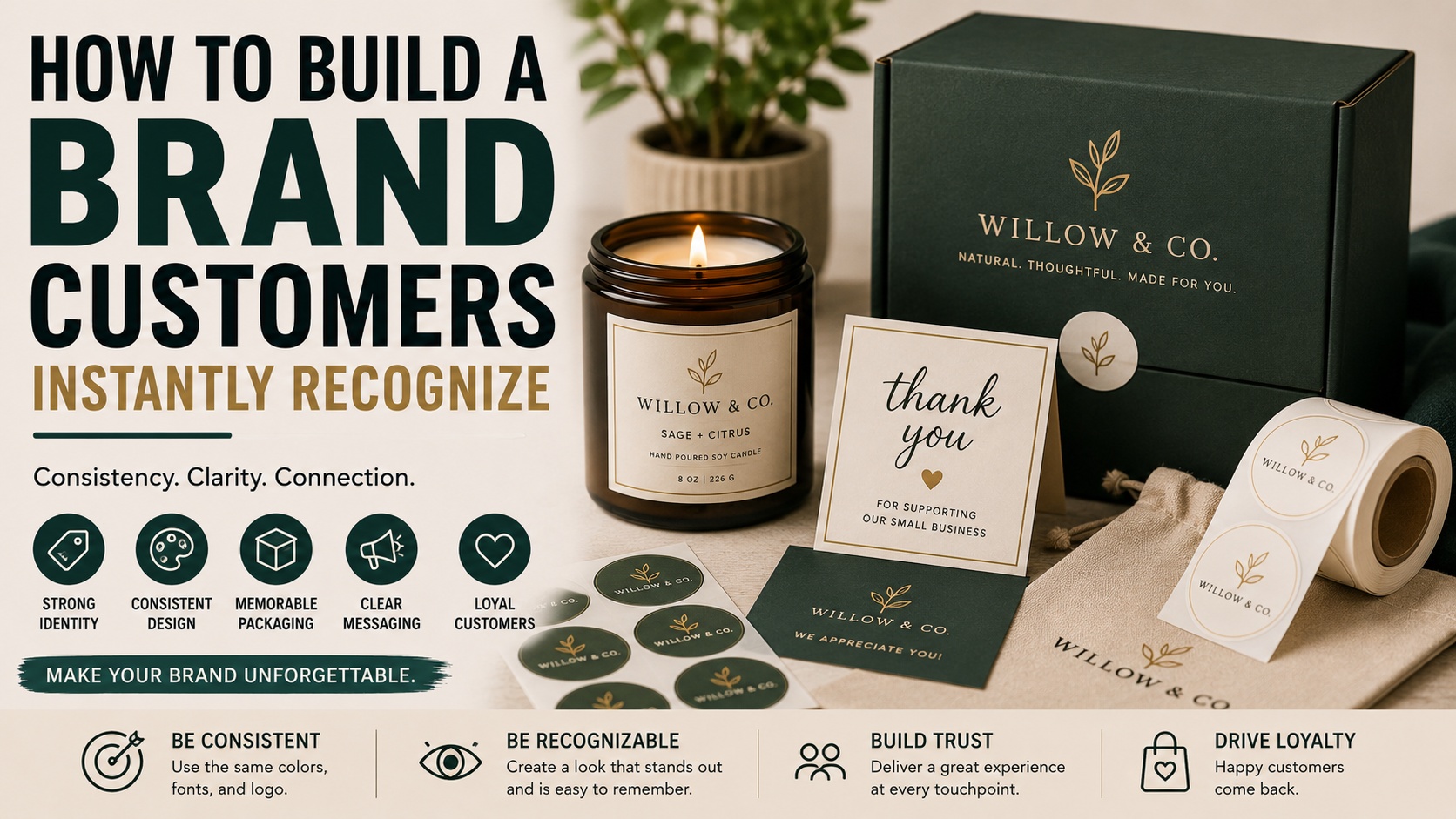
For example, a candle brand might use cream labels, forest green sticker seals, and a simple thank-you card in every order. A bakery might use bright round labels on every bag, box, and jar. An artist might use a signature sticker on every print sleeve and package insert.
If you want to brand bags, boxes, jars, tissue, or product wraps, custom label and packaging stickers can help create those repeating touchpoints.
Recognition comes from seeing the same details again.
Make Product Labels Part of the Brand
Product labels do more than explain what is inside. They teach customers what your brand looks like.
This matters most for businesses with multiple products. If every product label has a different layout, font, color system, and logo placement, the line can feel disconnected.
A strong label system should make products feel related even when the product names or variations change.
Keep these elements consistent:
- logo placement
- product name location
- font choices
- label shape
- main color palette
- icon style
- border or no-border choice
- size and detail placement
- spacing
Then let only a few things change:
- scent
- flavor
- color accent
- product image
- batch number
- variation name
This helps customers recognize your product family on a shelf, in a photo, or in a repeat order.
For example, all soap labels might use the same cream background, logo at the top, scent name in the center, and small color band at the bottom. Each scent gets its own accent color, but the overall layout stays the same.
That is how a product line starts to feel like a brand.
Build Recognition Across Digital and Physical Touchpoints
A customer may see your brand in many places before buying.
They might see a social post, website page, product photo, email, packaging insert, sticker, flyer, market booth, or review photo. If all those pieces look unrelated, the customer has to work harder to connect them.
Use the same brand system across both digital and physical touchpoints:
| Touchpoint | What Should Stay Consistent |
|---|---|
| Website | Logo, colors, tone, product photography |
| Social media | Image style, captions, graphics, colors |
| Product packaging | Labels, stickers, inserts, materials |
| Voice, layout, button colors, offers | |
| Events | Signage, table setup, handouts |
| Printed materials | Business cards, flyers, QR cards, thank-you cards |
| Product photos | Lighting, backgrounds, props, editing style |
This is where printed pieces can help. Business cards, flyers, postcards, stickers, and insert cards give customers something physical to connect back to the brand.
For small brands building local recognition, printed marketing materials can make online branding feel more real at markets, events, product launches, and shipments.
A recognizable brand should feel like the same business everywhere.
Keep Your Voice Consistent Too
A brand is not only visual.
The words matter. Your product descriptions, social captions, packaging inserts, customer support messages, emails, and review requests should sound like they came from the same business.
A brand voice can be:
- warm
- direct
- playful
- calm
- expert
- refined
- bold
- friendly
- simple
- detailed
Pick a direction that fits the business and customer.
A skincare brand might use calm, clear language. A food brand might use warm, sensory descriptions. An outdoor brand might sound practical and confident. A sticker brand might be friendly, simple, and a little fun.
Avoid changing personality every time you post. If your website sounds polished but your packaging insert sounds random, the experience feels less connected.
A simple voice guide can help:
- Use short sentences.
- Avoid hype.
- Explain clearly.
- Be helpful before being clever.
- Keep product details practical.
- Sound like a real person.
The customer should recognize how you sound, not just how you look.
Create Signature Brand Cues
A signature cue is a detail customers start to associate with you.
It could be visual, verbal, or physical.
Examples include:
- a color stripe on every package
- a round logo sticker on every order
- a specific illustration style
- a handwritten-style thank-you card
- a recurring phrase
- a certain label shape
- a consistent photo background
- a simple icon system
- a seasonal sticker freebie
- a specific packaging color
The best signature cues are easy to repeat. They should not slow your team down or cost too much to maintain.
For example, a small brand might use a deep green circle sticker on every shipment. Over time, customers start associating that sticker with the brand. Another business might use a bright yellow thank-you insert. Another might always photograph products on a warm wood background with the same prop style.
These details seem small. But they build memory.
Make Your Brand Easy to Spot in a Crowd
Customers often see your brand next to other brands.
That might happen on a market table, an Etsy search page, a retail shelf, a local event table, a social feed, or a Google image result. Your brand needs enough distinction to be noticed.
This does not mean everything should be loud. A quiet brand can still be recognizable if it is consistent and specific.
To stand out, avoid default choices:
- generic logo templates
- random color palettes
- overused stock icons
- too many fonts
- vague taglines
- product photos that look like everyone else’s
- packaging with no brand cue
- labels that hide the product name
Look at your competitors. Then decide what should make your brand easier to identify. It may be a color, shape, tone, photography style, product naming system, or packaging detail.
A brand does not need to be strange to be memorable. It just needs to be specific.
Use Repetition Without Becoming Boring
Some business owners avoid consistency because they worry the brand will feel repetitive.
But customers need repetition. They are not seeing your brand as often as you are. You may be tired of your color palette after looking at it for three weeks. A customer may have seen it twice.
Consistency does not mean every piece looks identical. It means the same core elements keep showing up.
You can vary:
- product photos
- seasonal colors
- campaign messages
- new product layouts
- social media formats
- limited edition stickers
- event displays
Keep consistent:
- logo
- core colors
- fonts
- tone
- packaging system
- label structure
- photography style
- brand promise
This gives the brand room to grow without losing recognition.
Make Reordering and Sharing Easy
A recognizable brand is easier to buy from again.
Make sure customers know where to go after the first purchase. Include your name and website on packaging, labels, inserts, QR cards, and product materials when it makes sense.
A simple naked link can work well on printed pieces: customstickers.com
For your own brand, use a clean URL that is easy to type. If the customer has to search through old emails or guess your handle, you may lose the reorder.
Also make sharing easy. Add your social handle to packaging inserts. Use branded stickers that customers might keep. Include QR codes only when they lead somewhere useful, such as a reorder page, care guide, or collection page.
Recognition improves when customers see your brand after the sale, not only before it.
Build a Brand Kit Before You Need One
A brand kit is a simple reference file that keeps your brand consistent.
It does not need to be fancy. It can be a one-page document, folder, or shared file.
Include:
- logo files
- icon files
- color codes
- font names
- product photo examples
- packaging examples
- label templates
- common phrases
- tone notes
- links to product pages
- print specs
This helps you avoid reinventing the brand every time you need a sticker, flyer, product label, social graphic, or packaging insert.
It also helps if you work with designers, printers, photographers, assistants, or freelancers. A clear brand kit reduces confusion and keeps the final pieces looking connected.
The more your business grows, the more useful this becomes.
Check Every Customer Touchpoint
Recognition is built through touchpoints. A touchpoint is any place a customer sees, reads, receives, or interacts with your brand.
Audit the full customer experience:
- website homepage
- product pages
- checkout emails
- social profiles
- packaging
- shipping labels
- thank-you cards
- product labels
- customer support replies
- review requests
- event signage
- printed handouts
- loyalty emails
Look for anything that feels off-brand or outdated.
A common small business issue is that the product has improved, but the branding still looks like the first version. Maybe the logo changed but old stickers are still being used. Maybe the website has one color palette and the packaging has another. Maybe product photos look newer than the labels.
Customers may not notice every inconsistency directly, but they often feel the difference.
Common Mistakes That Make Brands Hard to Recognize
Some mistakes make brand recognition much harder than it needs to be.
The most common ones include:
- changing colors too often
- using multiple logo versions randomly
- choosing fonts without a system
- designing each product label from scratch
- using inconsistent photo styles
- copying trends that do not fit the brand
- making packaging too generic
- hiding the brand name
- using unclear product names
- skipping printed touchpoints
- sounding different on every channel
- overloading designs with too many elements
The fix is not always a full rebrand. Often, the fix is simply choosing a system and sticking with it.
Quick Checklist for a More Recognizable Brand
Use this checklist before your next launch, packaging update, or product drop:
- Is the logo easy to read at small sizes?
- Are the same colors used across digital and print materials?
- Do product labels look like they belong together?
- Does packaging repeat one or two clear brand cues?
- Are product photos edited in a consistent style?
- Does the brand voice sound similar across all channels?
- Can customers find the website or social handle after purchase?
- Are stickers, labels, cards, and inserts visually connected?
- Does the brand stand out from direct competitors?
- Is the customer experience consistent from first click to delivery?
If you can say yes to most of these, your brand is already becoming easier to recognize.
Conclusion
Building a brand customers instantly recognize takes repetition, not random reinvention. The same colors, logo, labels, packaging, voice, photos, and customer experience need to show up often enough that people connect them with your business.
Start simple. Define what you want to be remembered for. Build a small visual system. Use it across your website, packaging, stickers, labels, social media, emails, and printed materials. Then keep refining without changing the core pieces every few weeks.
A recognizable brand does not happen because every detail is expensive. It happens because every detail feels like it belongs.
FAQs
What makes a brand instantly recognizable?
A brand becomes recognizable when customers repeatedly see the same visual and verbal cues. Logo, color, typography, packaging, product photography, tone, and customer experience all contribute.
Do small businesses need a full brand guide?
Not at first. A simple brand kit with logo files, colors, fonts, photo examples, packaging rules, and tone notes is enough for many small businesses.
How many brand colors should a small business use?
Most small businesses can start with two to four colors: one primary color, one secondary color, one neutral, and one accent. This keeps the brand easier to manage and remember.
How can packaging improve brand recognition?
Packaging gives customers a physical reminder of your brand. Repeating the same sticker, label, tissue color, thank-you card, or insert style helps customers remember who you are.
Should every product label look the same?
Product labels should feel related, not identical. Keep the same logo placement, fonts, layout, and general style, then change details like scent, flavor, color accent, or product name.
How often should a brand update its look?
Update the brand when the current look no longer reflects the business, confuses customers, or creates inconsistency. Avoid changing core visuals too often, because recognition depends on repetition.